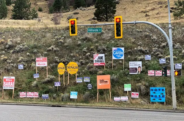
Announcing this year’s ‘Best Election Signs’ winners

Oct 13, 2018 | 5:00 AM

WITH ALL THE ISSUES to talk about in the civic election — parking, businesses taxes, dirty needles, the performing arts centre, housing and so on and so on — we seem to be worrying a lot about election signs.

Should they be banned? Should they be restricted to certain areas? Are some of them actually illegal?

Well, yes, to the last question. The fact that some signs don’t include contact information was brought up this week. I’ve noticed it as more and more of them have been planted.

It matters not to the rest of us but Elections BC takes these things quite seriously. Somewhere on the sign, there must be a line that says it is “authorized by” with the name of the financial agent (very often, this is the candidate) and a phone number, mailing address or email address.

For candidates who neglected this very important detail, it’s very easy to fix by printing off a bunch of small labels and sticking them on the signs. It’s advisable to do so, since penalties for breaking civic election rules include hefty fines and, theoretically, jail.

All it takes is a complaint from somebody who doesn’t like you or your signs, and you’re in the bad books of Elections BC.

Unfortunately, or fortunately depending on your point of view, there are no penalties for ugly signs. I actually enjoy really bad election signs because they add variety, and I like to critique them.

With this in mind, a refresher on signs from Prof. Mel is in order. I’m sorry to have to report there has been little if any improvement since I started handing out my Election Sign Awards in 2008, but let’s rate what’s on offer in 2018.

The first rule of election signs is that you have to be able to read them as you drive by at 60 klicks (unless there’s an available spot near a stop sign). This is also the rule most often ignored.

You’ll notice there’s no point in even looking at a lot of the current crop of signs because they’re unreadable for a variety of reasons.

Let me use a couple of examples of good signs to illustrate. The envelope please. The best election sign out there belongs to Bill Sarai. He also has the largest number of signs, but we aren’t counting numbers today.

Sarai has the advantage of a short name that he can put in big letters, even on the small lawn-sign version. But he does more than that. His name is in a reverse font — that is, a large block of red surrounds his name, which is in white.

He’s not the only candidate who uses that technique but he also sticks with the basics. The only other words on his signs are “Vote” and “For City Council.”

No clutter, and every word big enough to be able to read it as you drive by.

A close second, and the winner in the school trustee category, is another candidate with a short name, incumbent Joe Small. He chose to put the fonts in reverse for the detail words instead of his name, which isn’t quite as effective but still pretty good. And he cleverly left room to add “Re-“ stickers in front of “Elect” to update the signs he used four years ago.

“Re-elect” is also a very effective way of telling people you have experience on the job.

Rule Number Two is never mind slogans. They have to be in such small letters nobody can read them, and we don’t have the time nor the interest anyway.

So slogans like Arjun Singh’s “Smart thinking, community linking,” Dennis Giesbrecht’s “For a city that works,” Caroline King’s “Taking action, getting results” and Jennifer D. Adams’ “The common sense candidate for City council” are pretty much wasted space.

And Dieter Dudy’s slogan is so long I’ve forgotten it, but at least you can read it if you slow down and squint. Denis Walsh, on the other hand, has beautifully designed signs but it’s impossible to read his slogan because of the solid colour on solid colour.

I’m quite curious about what Walsh’s sign says, but not curious enough to jump the curb, park on the sidewalk and walk back to look.

Really, what do slogans tell us anyway? Nobody would disagree with any of them.

Rule Number Three is shapes. Be square. Round signs look awkward. Nicholas Adams’ cog-shaped signs are unique — especially the big trippy two-tone fluorescent jobbies that make you go cross-eyed as you drive by — but I’m not sure what they’re supposed to tell us.

Final criterion is colours. They must be strong, not washed-out greens and pale blues and purples and yellows. So, sorry, Heather Grieve, Kerri Schill, Alison Klie and Meghan Wade, but your mark is “needs improvement.”

It’s a shame candidates spend so much money on signs that don’t work. Signs are only one tool in electioneering but they’re important enough to get right.

Congrats to the winners. Class dismissed.