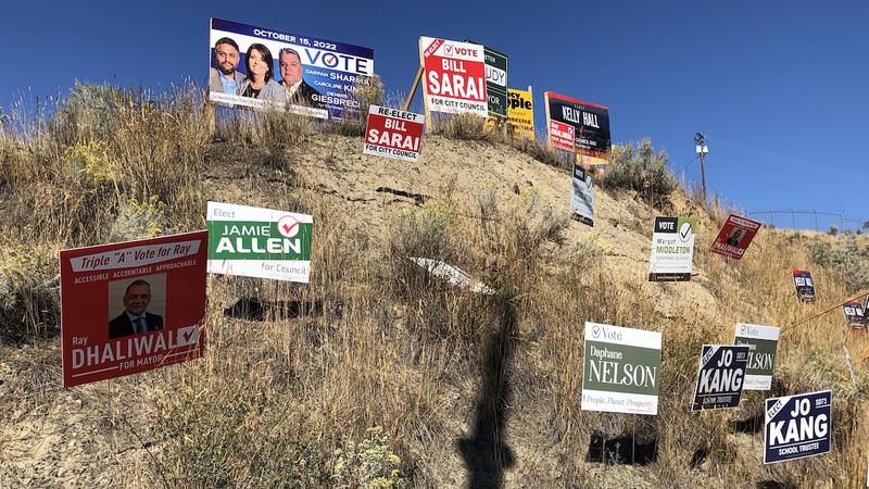
Image Credit: Mel Rothenburger
Armchair Mayor

ROTHENBURGER: Time for the Armchair Mayor’s campaign sign report card

Oct 8, 2022 | 6:29 AM

PAY ATTENTION, CLASS, it’s time for the Armchair Mayor’s election campaign signs report card, which I’ve been providing each election since 2008.

I probably pay more attention to campaign signs than most. That’s because I like testing myself to see if I can read the darn things as I drive by. As is the case with every other driver, I have literally one second or less to a) notice the sign and b) read it while not driving off the road.

The average human can absorb 5.91 words per second in silent normal reading. If we really boot it, we can hit 8.21 words.

This is a fact many candidates don’t pay attention to. As they’re sitting around with their campaign teams brain storming their signs, they focus on what looks great sitting on a kitchen table instead of what it will look like on a lawn or on the side of a busy road.

As a result, they end up with signs that simply don’t work and are, frankly, a waste of valuable campaign dollars. Those who understand what campaign signs are for, and what they’re asking of passersby, give themselves an advantage over their competitors, at least in standing out on a crowded hillside or roadside.

So let’s look at the criteria and how the current crop of signs measures up.

MESSAGE: Keep it short. Name and position (council, mayor, school trustee, etc.). You probably spent a lot of time dreaming up a slogan but it’s of no use on your signs. Nobody has the time to read it.

USE OF COLOUR and FONTS: Bold ones, please. No pastels. Maybe they’re calming or something but the problem is with visibility, especially when you’re up against 20 or 30 of your opponents’ signs. As for fonts (or typefaces, if you prefer), again, keep them bold, without serifs or italics. Despite all this, there are a couple of examples I’ll give you of signs that break all the rules but look good anyway.

OVERALL DESIGN: This is somewhat hard to define because beauty is in the eye of the beholder but it’s a matter of overall impression including colour, typefaces, use of photos and how they’re arranged.

Let’s look at the message first. Without doing an actual count, I’d say about half the signs fail on this score. It’s just too tempting to use those slogans. Website addresses are just added clutter.

Campaign signs, especially lawn signs (those are the small ones, usually 24 inches wide by 20 inches deep), aren’t the place to outline platforms. They’re for telling people you’re in the race. For example, Randy Sunderman’s “Achieving Real Results Together” on his larger signs brings his word total to eight, on the very cusp of being beyond our ability to take in as we drive by. Plus, the use of five different fonts complicates things.

Some of Ray Dhaliwal’s signs ask too much of us. Who has time to read, “Triple ‘A’ Ray, Accessible, Accountable, Approachable, Ray Dhaliwal for Mayor” as we drive by at 60 km/h? He has a much simpler “Ray Dhaliwal for Mayor” version that nicely gets the job done.

Now let’s check out colours. Bright yellow or yellow-orange background with deep blue letters is being used by several candidates this year — Sunderman, Nancy Bepple and Arjun Singh among them — and it’s a highly effective combination.

However, while I like Arjun’s choice of colours, I find his round signs off-putting, although the strategy is clearly to stand out from the square ones of other candidates and maybe they do. Ray Dhaliwal’s bright red colour is good.

Daphne Nelson’s signs are really hard to read due to a combination of the pale colour, serif font and too many words.

As for overall design, I’ve got to give high marks to Margo Middleton, whose signs break all the rules. She uses a pleasant combination of reverse, boldface, lightface, caps and lower case and way too many words. They don’t do what she needs them to do but they’re nice to look at if you have the time, which you probably don’t.

Mayoral candidate Sadie Hunter breaks the colour rules, too, yet her large signs work well because the font is black against — what is it, robin’s egg blue? On those large signs, there’s plenty of room around her photo and the letters, which could have been bolder but employ the simple message that she’s running for mayor. Her lawn signs are much less effective.

And since we’re on the subject of mayoral candidates, Dieter Dudy’s signs are also simple and effective with a tight, short message on top of a dark green background. He also keeps his big signs consistent with his lawn signs.

Reid Hamer-Jackson is focused on really large signs so it’s hard to compare with the rest. His colours are good, though.

Once again, I have to award Best in Show to Bill Sarai, who keeps it simple, bright and bold with red, white and a touch of black. Honourable mention goes to school board candidate Jo Kang, who sticks to the basics with his white on dark blue signs.

As for the worst, I’ll leave that to you. Election signs are as much art as they are science, and they’re a learning experience. Some signs score high on colour and fonts but low on message, while some are the other way around. And, as I’ve pointed out, good design can’t save a sign if the fundamentals are ignored.

We don’t elect people based on their signs; they can only provide clues about who’s running. To do that, though, we’ve got to able to read them.

Maybe Victoria council candidate James Harasymow is onto something — the message on his signs is, “Sorry about the signs.”

——

Mel Rothenburger is a former mayor of Kamloops and a retired newspaper editor. He is a regular contributor to CFJC Today, publishes the ArmchairMayor.ca opinion website, and is a director on the Thompson-Nicola Regional District board. He can be reached at mrothenburger@armchairmayor.ca.

Editor’s Note: This opinion piece reflects the views of its author, and does not necessarily represent the views of CFJC Today or Pattison Media.