(Submitted photo/Mel Rothenburger).
ARMCHAIR MAYOR

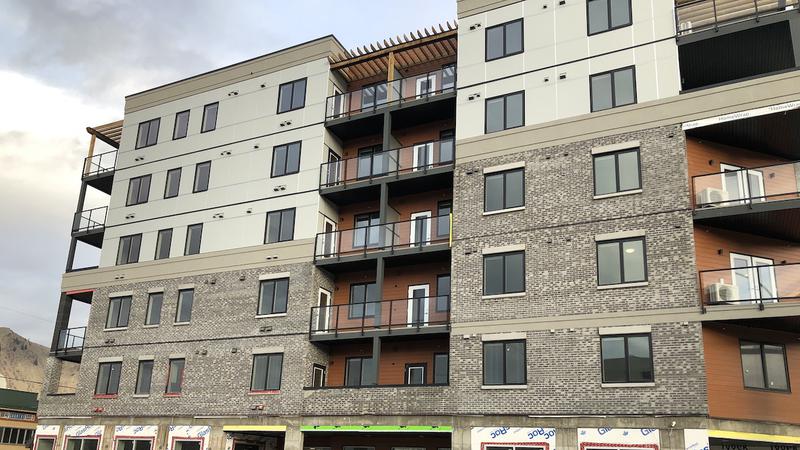
ROTHENBURGER: Our cityscape makes a daring switch from beige to greige

Jan 29, 2022 | 6:46 AM

I’VE GOT GOOD NEWS and bad news.

You might have heard me rant a time or two about the beigeness of Kamloops, a condition caused by myopic planners able to see only “earth tones.”

Symptoms include a feeling of drabness and sameness resulting in architectural brain fog. Dwellings and corporate buildings have both been infected with it, but things are changing.

That’s the good news. The bad news is that the new colours of choice are grey and greige. A variant of the original affliction.

All one has to do is take a look at the many new apartment blocks and office buildings under construction or in the works. Grey and greige everywhere. Grey siding, grey bricks, grey facades.

Very earthy. Apparently, adding a few horse-bun-coloured panels or alcoves here and there represents a daring splash of colour. Talk about breaking new ground.

And don’t even get me started on the architecture itself. Grey brick with some brown arbor-like adornments, arranged like a child’s building blocks or Lego, but monotone, of course. Big square blocks of boredom. (I admit, however, to a certain grudging admiration for the grey-and-brown apartment unit that has the cheek to call itself The Colours.)

Out in the burbs, grey subdivisions are the modern-day version of the “ticky tacky” houses — except bigger — made famous by Pete Seeger in 1963 when he recorded Little Boxes. The difference is that the houses in the song had colour: “There’s a pink one and a green one, and a blue one and a yellow one.”

You have to go a long way in Kamloops before you see a pink one or a green one or a blue one or a yellow one. Here and there, though, some rebel eschews the earth-tone directive and puts actual colour on his or her house. Whoever owns the bright lemon-coloured house on Schubert Drive is one of my heroes.

The Kamloops cityscape is like the weather in January — dreary, washed out and deflating. How can a city with so much going for it, so many great amenities and such an active citizenry, deny itself the joy of colour?

When I think of what a town should be, I think of Jellybean Row in St. John’s, the postcard main street of Tobermory, the post-Apartheid Bo-Kaap houses of Cape Town, the “painted ladies” of San Francisco, and harborside streets of Copenhagen. I haven’t been to all of them, but most, and there’s an entirely different feel to them — one of energy and aliveness.

I’d always assumed that the brightly coloured houses of St. John’s had always been that way; the story goes that fishermen painted them in vivid hues so they were easy to spot from out on the ocean.

But the palette of colour was greatly accelerated in the 1970s when the city’s leaders were looking for ways to put St. John’s on the map. Tourism St. John’s knew what it was doing — the flamboyant homes are now a symbol of the city, adorning everything from T-shirts to brochures and mailboxes. People go there just to see them.

In Tobermory, a small town on the isle of Mull in Scotland, its rainbow main street features lovely restored historic buildings. There, they understand the value of both heritage and colour. You feel good just walking down that street. It was even the location for a TV series.

According to psychologists, happy colours in the home make for happy people. Orange, yellow, blue and green lift the spirits. As designer Sarah Barnard put it, homeowners should pick colours that make their hearts sing.

But what would the neighbours think? “Clients who request dynamic exterior colour palettes usually seek joy through personalization and are not terrifically concerned with what the neighbours think,” she said, though acknowledging that brightly coloured houses can evoke a mixture of positive and negative emotions, depending on who’s looking at them.

Kamloopsians need not worry about that, though. There will always be those big gray boxes downtown and all those carefully conforming strata condos on the hillsides to remind us of our dedication to earth tones.

Mel Rothenburger is a former mayor of Kamloops and a retired newspaper editor. He is a regular contributor to CFJC Today, publishes the ArmchairMayor.ca opinion website, and is a director on the Thompson-Nicola Regional District board. He can be reached at mrothenburger@armchairmayor.ca.

——

Editor’s Note: This opinion piece reflects the views of its author, and does not necessarily represent the views of CFJC Today or Pattison Media.

View Comments